Sunday 25 March 2018

Week 4 Independent Study

Original section:


Clients:
Above - Gucci (grand)
Below - CJ Hendry (subject)

Chosen three images:

Section 1

Section 2

Perspective

Incorporated textures:

Dense
Manipulative

Packed
Radiant
Beehive
Three animations/videos:


Animation 1:
This animation serves to illustrate the most relevant sections and views. These views succeed in highlighting the symmetry and geometries of the design. It spotlights the contrasting geometries in each space, each of them characteristic of their clients and intentions (i.e. open middle space or complex upper gucci space). Furthermore, it shows the journey that exists in travelling from each individual space.


Animation 2:
This animation aims to show how the building relates to its context and where it sits in the urban setting ( visually distinct and unique to both center and separate itself in the urban context, much like the way Central Park does in NYC.)

It also aims to imitate what walking up to it would look like, showing the middle section, a symposium-esque meeting place, and also showing the lower section, an open mini modern art gallery for CJ Hendry's work.. 


Animation 3:
The last animation finishes the interior walkthrough, displaying the upper section. It displays the many rooms surrounding the center 'crown'. These are meant to be studio rooms, for testing out ideas, so that in each direction you look, a different style and accumulation of fashion concepts would be present.

More importantly, the animation also shows the way the light works on the model as the sun rises and sets, highlighting the geometries as well as the 'life' of the building throughout the day. It worked out surprisingly well, almost looking like an ancient sundial, which is pretty cool.


Tuesday 20 March 2018

Week 3 independent study

Lower Section:

Client: CJ Hendry

The lower section, from the beginning, was always a design that I thought very well reflected CJ Hendry's work: a lot of blank space centered by a well crafted subject that, with much detail, ultimately spotlights itself by contrasting against its surroundings.

This shot demonstrates that. As you can see, the client's work is very much at home, fitting very well into the colour scheme, thus, not drawing attention away from the client's work the way colour would. More importantly, the pieces of art now becomes the aforementioned 'subject' and the surrounding architecture becomes that 'blank space' that highlights the client's work.

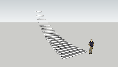
The floating staircase also adds to the 'spaciousness' of the lower section. Also, the stairs resemble modern architecture, working well with the displayed modern art. 


Upper Section:

Client: Gucci

The continued black and white scheme similarly works to highlight the client's work but in the opposite way as the lower section. Here, the client's colourful schemes are clearly highlighted as they are backdropped against the black and white textures.

Additionally, the ramp (the one the models are on) are meant to imitate runways in fashion shows. The table was added in to display the Gucci handbags.

The stairs that slope up towards the upper section, though not displayed, are also meant to imitate the robes/drapes of Gucci whilst simultaneously emphasising the grandeur and 'royalty' of the upper section.

Related video/ inspiration video:

This is the chosen related video. It is centered around Louis Khan's work on a university art center and briefly touches on Khan's architecture. Khan has had influence on this design of the sketchup model featured in experiment 1. His ideas on geometries and shadows especially have very much enlightened this model's design.

Sunday 18 March 2018

36 textures

I.


II.

III.

I.
1. Airy 2. Iridescent 3. Lightweight 4. Ephemeral 5. Weightless 6. Transparent 7. Cloudy 8. Vibrant    9. Organic 10. Alien 11. Neon 12. Radiant

II.
13. Regenerative. 14. Immortal 15. Conductor 16. Dense 17. Uniform 18. Geometric 19. Renewable 20. Repetitive 21. Technological 22. Contrasting 23. Metallic 24. Vitality

III.
25. Structure 26. Manipulative 27. Purposeful 28. Luminous 29. Sequential 30. Systematic              31. Packed 32. Beehive 33. Scientific 34. Structure 35. Organized 36. Logical

Week 2 independent study

Sketchbook sections:


Staircase 1 (Lower):


Associated word: Subject/Blank space.
Material: Concrete/Concrete slabs.

Staircase 2 (Upper):

Associated word: Grand/Royal.
Material: Stone/Marble.


36 Sections

In-class sections:


After-class sections:

Week 1 independent study


Model 1

Chosen section:
Above:
Client - Gucci
Word - Grand
Below:
Client - CJ Hendry
Word - Subject

Perspective:


Section:


Model 2:
Chosen section:
Above:
Client - Gucci
Word - Flamboyant
Below:
Client - Revival
Word - Rustic
Perspective:


Elevation:


Wednesday 7 March 2018

3 Words

Best piece of creative work:


This is a photograph I took early in the morning. It symbolizes man's desolation and lack of humanity after the industrial revolution. However, the sun represents hope; hope that we will redeem ourselves and return to our former glory. This is my best piece of work.

Interesting architecture:
Image result for san francisco architecture

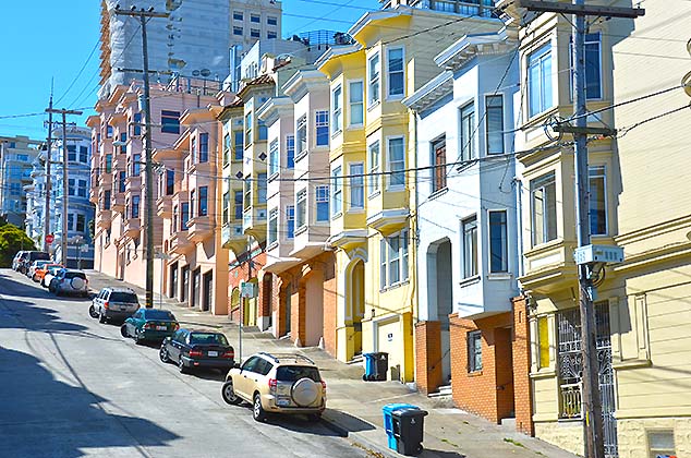
This is a photo of some houses in San Francisco. This is some pretty interesting architecture; it is the type of architecture that so uniquely and loudly shouts San Francisco, highlighting the colors and landscape of the city.

Original photograph:
This is a photograph I took when I went through the botanic gardens. I don't claim to be an expert photographer but I think this adequately captures the character of Sydney.

Noun, Verb Adjective:
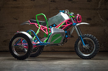
Revival Cycles:
Image result for Revival Cycles
Playground, jumping, playful.

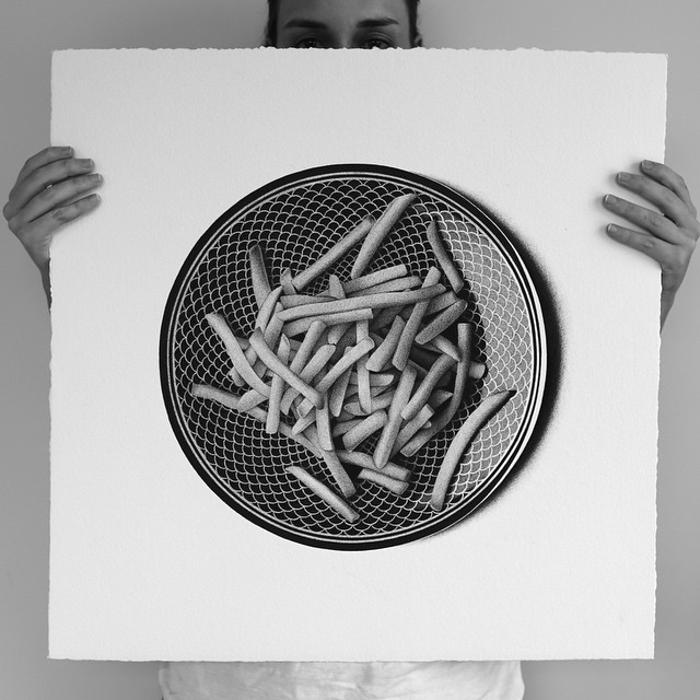
CJ Hendry:
Related image
Flavor, salivating, delicious.

Gucci:


Wes Anderson, calming, whimsical.